
STUDENT WEB PORTAL • HANDED OFF 2024
Student Web Portal UI/UX Redesign
ROLE
UI/UX Designer
TIMELINE
TEAM
1 Designer
1 PM
SKILLS
User Research
Usability Testing
Prototyping
UI/UX Design
OUTCOMES
Enhanced Navigation
Clear menu structures and consistent layouts reduced task completion time by 32%
Increased Task Completion Rates
Simplified processes resulted in a 27% increase in successful task completions among first-year students
Improved Error Handling
Better error handling decreased complaints by 37%, enhancing application reliability
INTRODUCTION
Outdated portal slowing 15k students in their daily (already boring) academic activities
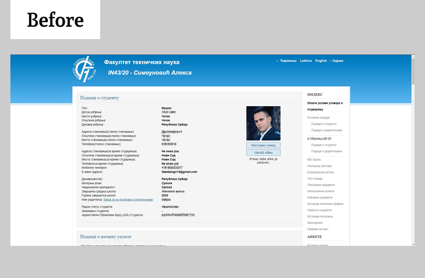
The existing student service portal at the Faculty of Tehnical Sciences, University of Novi Sad had not been updated in over a decade. Its outdated design and poor usability created frustration for more than 15,000 students who depended on it for academic tasks such as exam registration, success tracking, and other administrative stuff.
Confusing interface caused stress in students’ daily activities. This made it clear that the system was no longer aligned with the needs and expectations of a modern academic community expecting a Technical Faculty to have a modern portal.
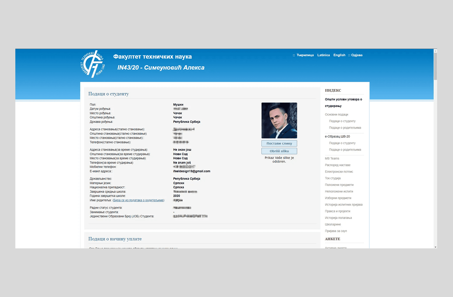
Old Design of Student Web Portal
SOLUTION
A modern, motivating, and student-centered web portal
The Faculty needed a portal that is easy to use, visually appealing, and supportive of students’ daily tasks. The redesign simplifies academic activities, reduces stress, and motivates students by giving them a tool they can be proud of. From exam registration to tracking progress, the portal now makes non-learning tasks engaging.
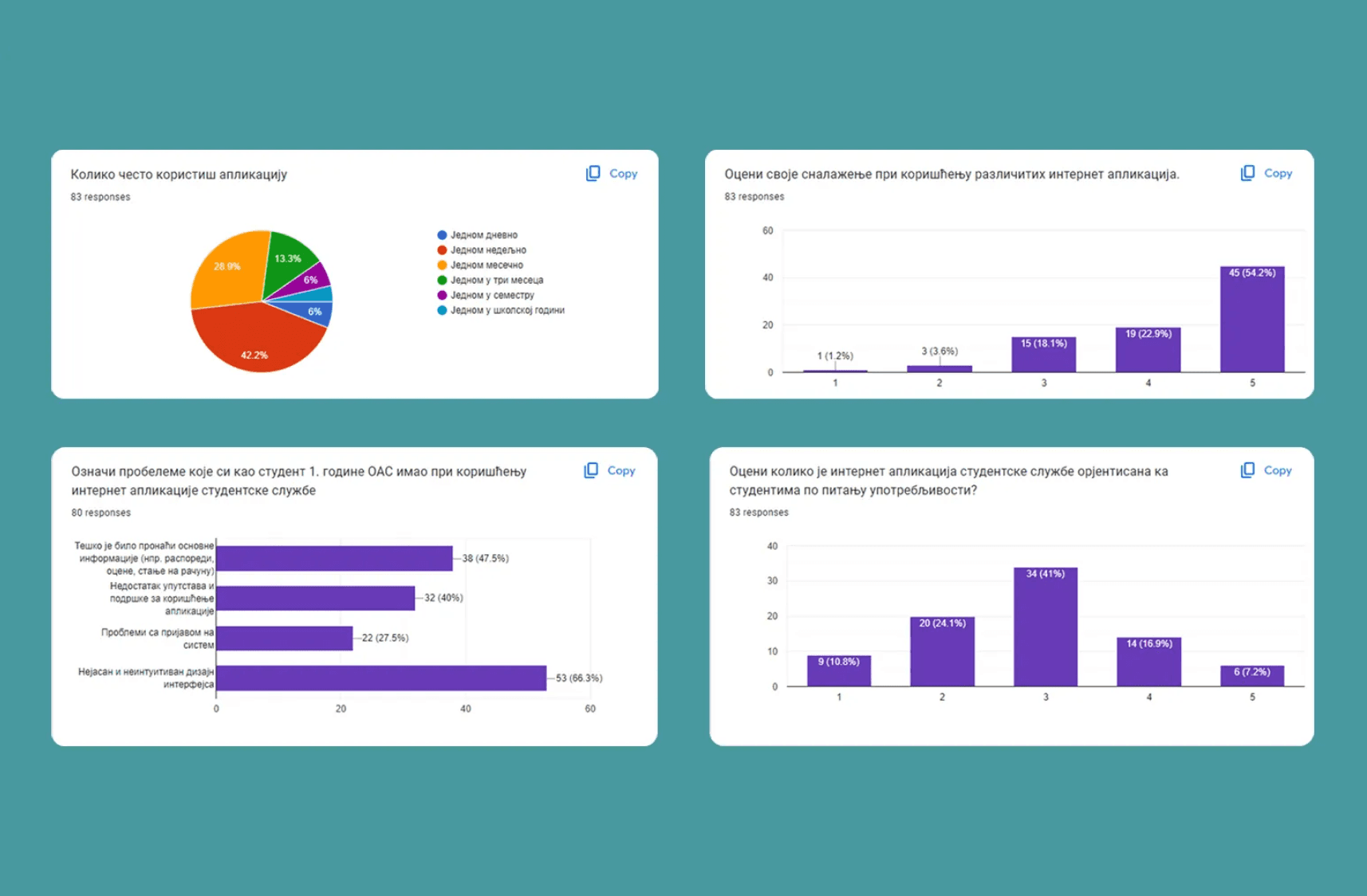
USER RESEARCH
Understanding student pain points to design a portal that truly makes their academic life easier
To create a student service portal that genuinely supports academic life, I conducted thorough user research. I surveyed 83 students across 8 programs and held user interviews with 10 students from different years of study.
Survey Results Screenshots
The research highlighted recurring frustrations: complicated navigation, inconsistent page layouts, confusing exam registration, and limited guidance or support. Students expressed a strong need for a tool that saves time, reduces stress, and provides visibility into their academic progress. These insights formed the foundation for every design decision in the redesign, ensuring that the new portal addresses real user needs rather than assumptions.
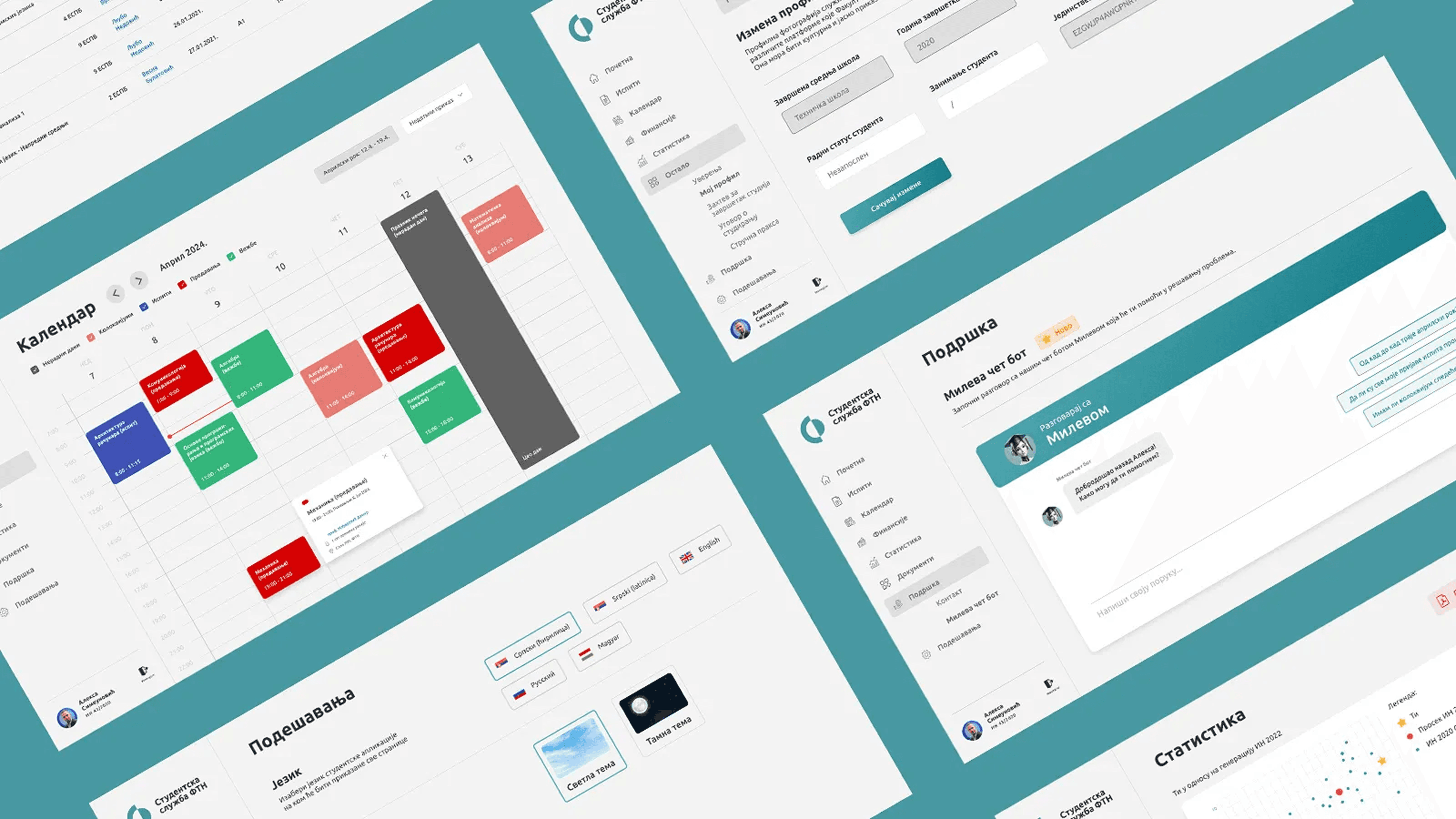
LOGIN PAGE
Poor login page design creates a negative first impression of the Faculty of Technical Sciences
The login page is often the first interaction students have with the portal, making it a critical point for creating confidence. In the old version signing in was frustrating, especially for students who forgot their passwords or wanted to stay logged in. This outdated experience not only slowed down students but also gave an unprofessional impression of the Faculty of Technical Sciences.
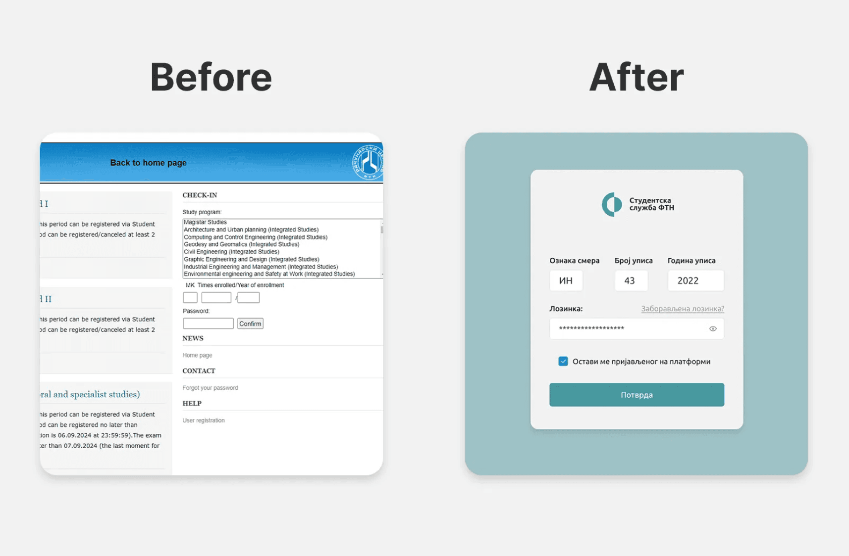
Log-in screens before and after the redesign
The redesigned login page is showing only essential fields, offering a “Keep me signed in” option, and guiding users through password recovery via email, reducing reliance on support staff.
HOMEPAGE
Students overwhelmed by irrelevant information
In the old version, homepage displayed too much poorly organized information, leaving students frustrated and confused about what actions to take first. Survey and interview feedback showed that students needed quick access to essential academic data, such as account balance, registered exams, published results, and performance statistics, without having to hunt through multiple sections.
Screenshot before redesign
The redesigned homepage prioritizes clarity and relevance. Students now see the most important information immediately after login, with interactive elements like clickable statistics charts and exam counts that link directly to detailed pages. A simplified navigation bar and intuitive layout reduce cognitive load, helping students stay focused on their academic priorities and feel confident using the portal.
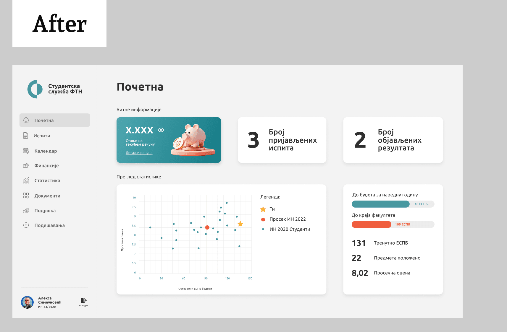
Screenshot after redesign
EXAMS
Exam interactions should be easy since students spend most of their time here
The redesign organizes exam information in clear tables and modals, shows deadlines and account balances, and centralizes completed exams with summary statistics. Students can now register and track exams quickly and without stress and errors.
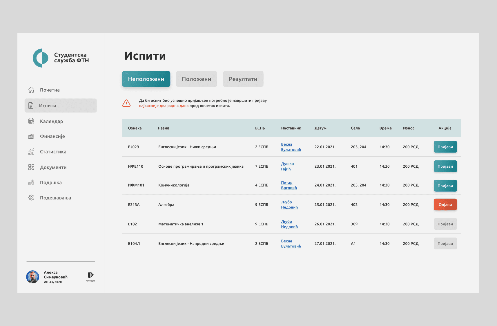
Exams page, the most relevant to students
ACADEMIC CALENDAR
How to help students manage their time better?
The redesigned calendar, inspired by Google Calendar, gives students a clear view of their academic schedule, with weekly and monthly options. It highlights lectures, practical sessions, exams, and non-working days. Clicking on any entry opens a modal with details and lecturer contacts, helping students plan efficiently and avoid conflicts.
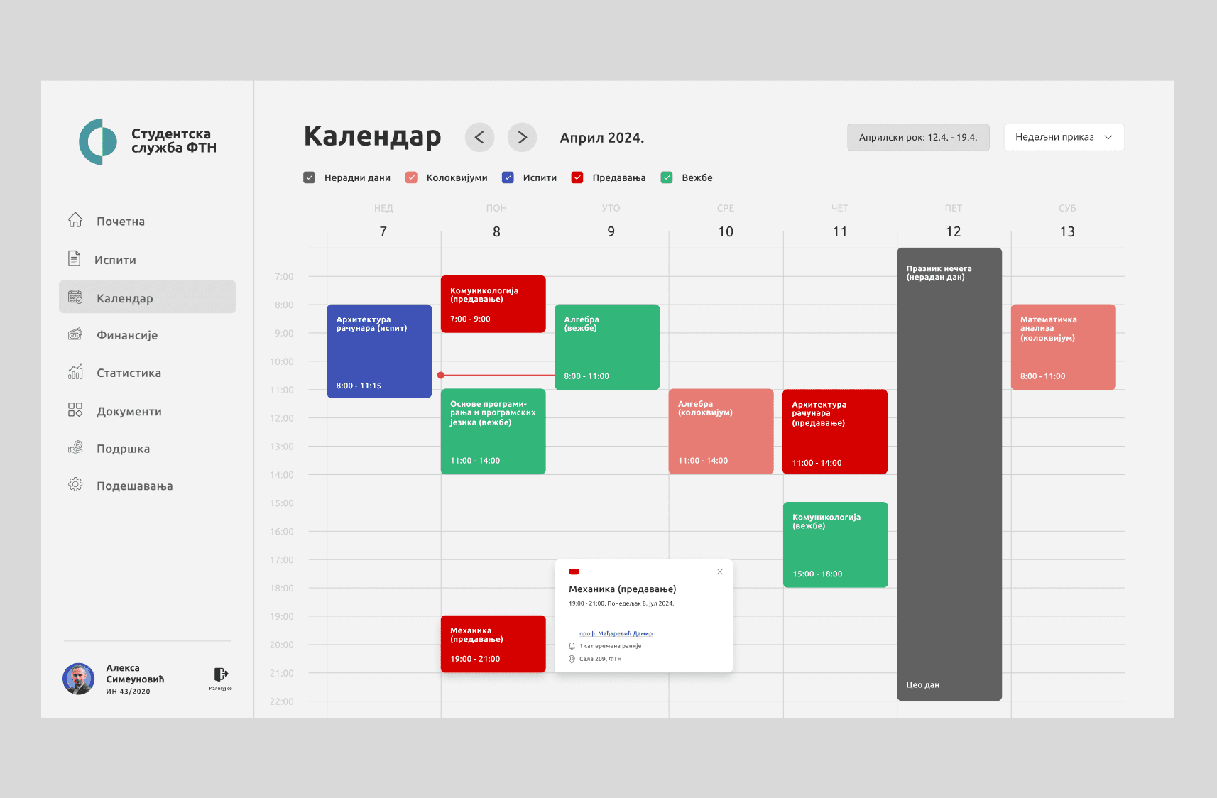
Weekly view of the academic calendar showing lectures, exams, and key deadlines
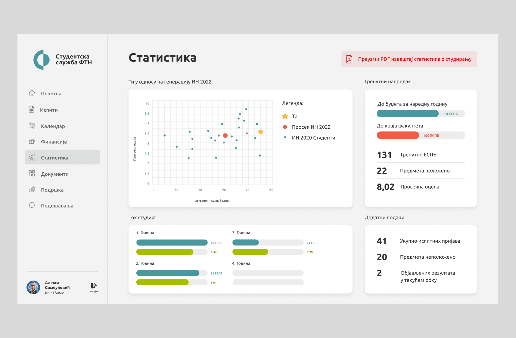
STATISTICS
Anonymous comparing with peers motivates students and drives progress for the whole generation
The redesigned statistics section allows students to see their academic performance compared with peers, fostering healthy competition and motivating improvement. Charts and key metrics give quick insights into grades, completed exams, and overall progress. While gamification encourages growth for many, we also need to carefully consider students who are less comfortable with comparisons, ensuring the system supports all types of learners without adding stress.
Weekly view of the academic calendar showing lectures, exams, and key deadlines
STUDENT SUPPORT
Faculty lacks proper support for students facing issues
Survey results showed that 83.5% of students felt unsupported when using the portal. Key problems included low availability of support options, and unresolved technical issues. To address this, we introduced a dedicated “Support” section and the Mileva Chatbot, designed to provide instant guidance and answers to common questions.
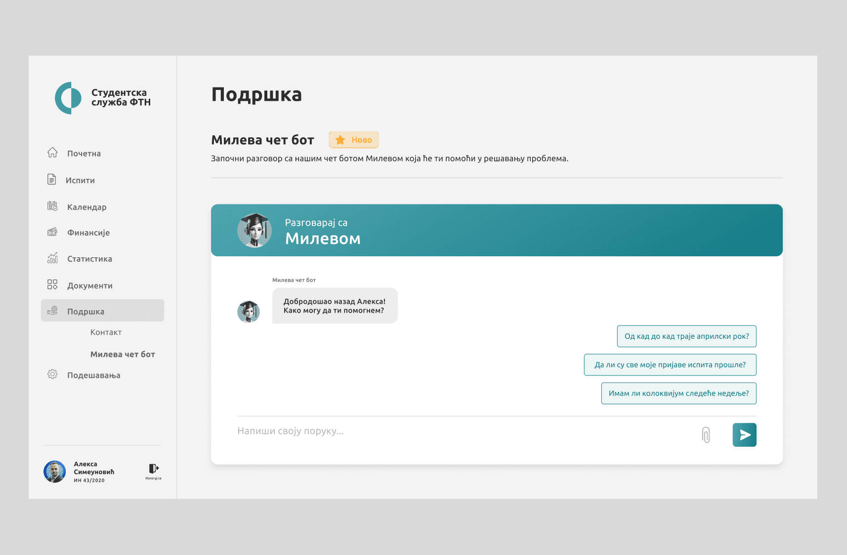
Interacting with Mileva Chatbot to quickly solve student issues
DARK MODE
Dark mode brings a modern and comfortable user experience
Users asked for it and the application now allows toggling between light and dark themes. This modernizes the interface while catering to individual preferences and reducing eye strain during prolonged use. Dark mode is becoming an expected feature in modern apps, ensuring the portal feels up-to-date, comfortable, and visually appealing for all users.
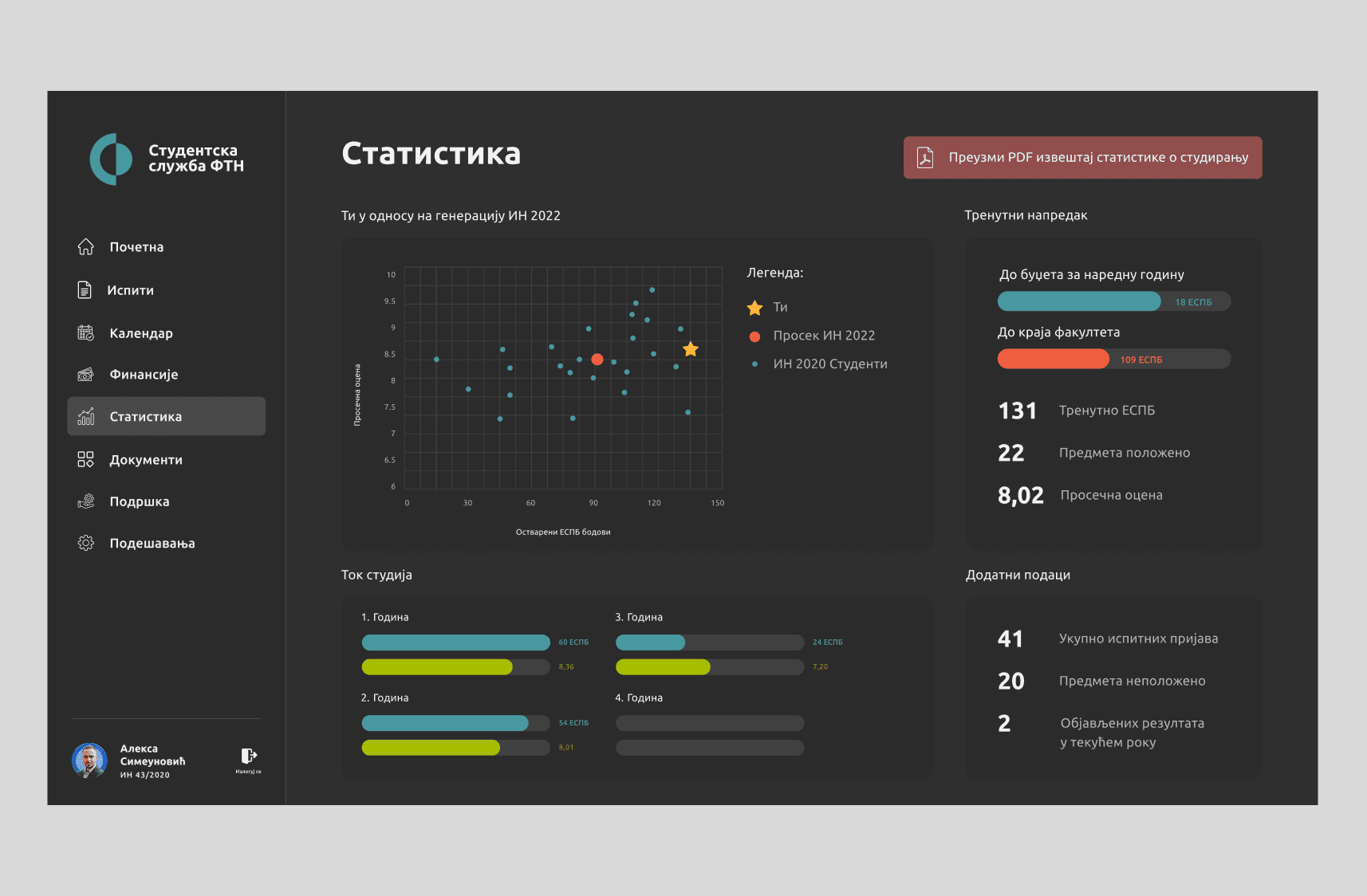
Statistics displayed in dark mode
PERSPECTIVE
Future features to enhance the student experience
The redesigned student service web application sets a solid foundation, but there is still room to grow. Future improvements could focus on introducing gamification elements to motivate students, adding sections for student clubs and extracurricular activities, and providing personalized recommendations based on academic progress.
These enhancements would not only make the platform more engaging but also help students organize their time, track achievements, and feel more connected to the academic community. Thoughtful implementation of these features can turn the application into a central hub that supports both learning and personal growth.
REFLECTION
Good user research is a superpower
Surveys and interviews revealed core issues like confusing exam registration and poor navigation, proving assumptions are no match for real data.
Small changes, big impact
Simplifying the login modal and graduation request flow showed how minor tweaks can remove major frustrations.