
MOKROGORSKA • SHIPPED 2025
Structured Website Redesign
ROLE
Product Designer
TIMELINE
TEAM
2 Engineers
1 Designer
SKILLS
End-to-end design
User Research
OUTCOMES
Bounce rate dropped after redesign, better first impressions
With a clearer structure, leads stayed longer and engaged more
Users spent more time exploring programs
Navigation used to stop visitors at one page. After redesign, they clicked deeper and spent more time discovering options
Trust in the school grew with social proof sections
By showing history, certifications, and the team, the website reportedly felt more credible
PROBLEM STATEMENT
Redesigning the website to clearly present a complex business model
Mokrogorska Business School approached us to redesign their website to communicate a new model of five core needs across more than 20 programs. The goal was to reduce bounce rate, increase session duration, and build trust among entrepreneurs and HR managers who are careful when choosing educational programs.
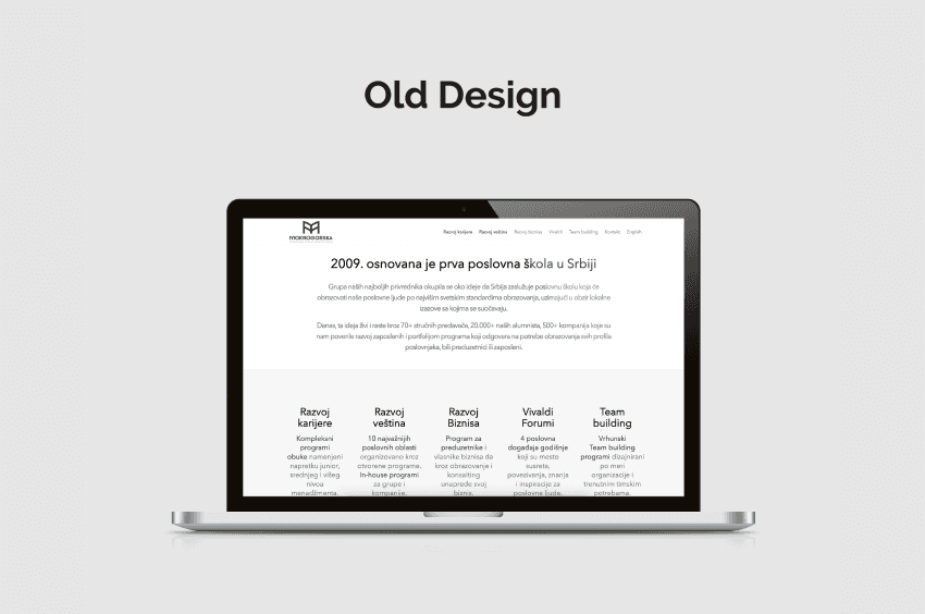
Old Website Design
USER RESEARCH
Insights from staff and prospective students shaped our design decisions
We conducted interviews with 10 staff members who collectively guided over 20,000 alumni, and combined these with conversations with prospective students. This research allowed us to identify five primary personas: entrepreneur, C-level executive, HR manager, parent, and aspiring leader.
MOBILE FIRST
Discovering that mobile access drives engagement
Research showed that 62% of users preferred browsing the website on mobile devices during commutes or work breaks. This insight became the guiding principle for layout, interaction patterns, and content prioritization. Mobile-first design was essential to ensure fast access to key information and a frictionless experience for all personas. We will use this insight to work with marketing department on growing social media presence (phone consumed).
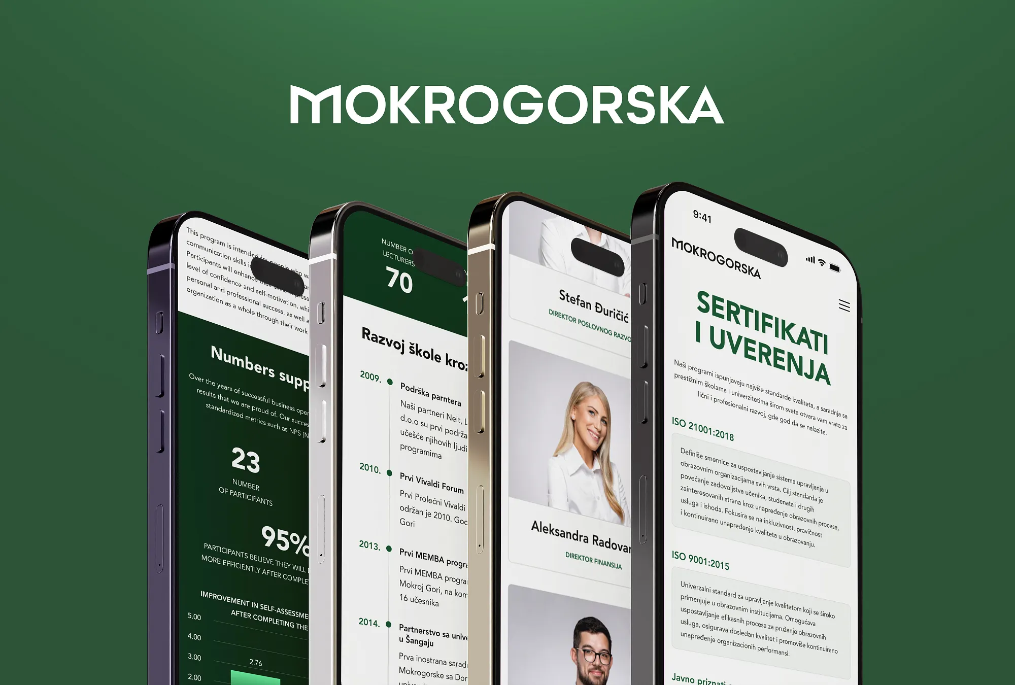
Mobile Mockups
INFORMATION DESIGN
Organizing over 20 programs into clear paths
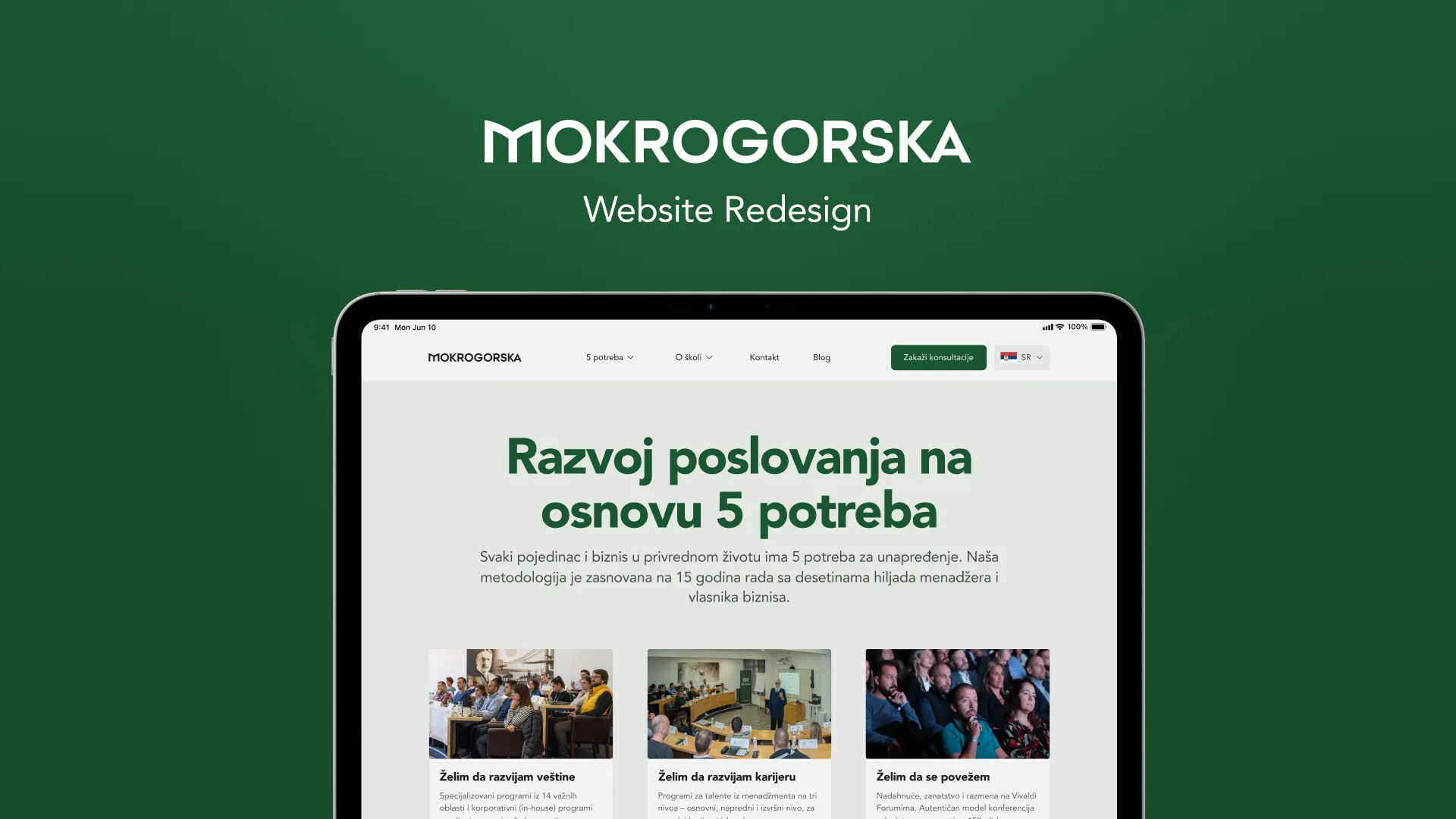
I mapped more than 20 programs into five clear paths aligned with user goals. Each path included concise program descriptions and relevant testimonials. This structure allowed users to understand their options without navigating dense pages. A new mega menu surfaced the five core needs and revealed program categories, helping users reach relevant content with fewer clicks.
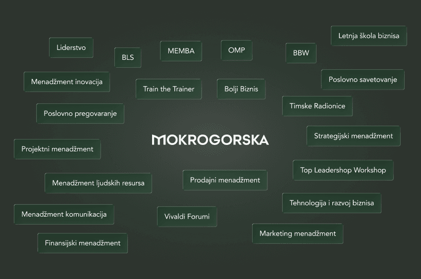
20 Mokrogorska's Programs
HOMEPAGE
Creating a strong first impression that builds trust
The homepage introduced the five-needs model with short, impactful statements. Alumni stories and a brief CEO video reinforced trust immediately. Users could see credibility, outcomes, and program relevance without going through other pages.
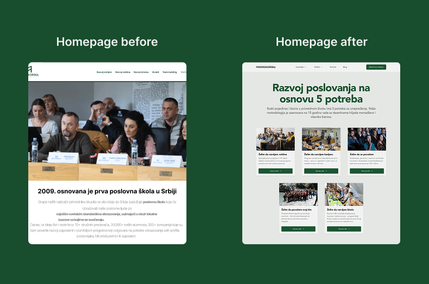
B/A Homepage
MEGA MENU
How I turned hard navigation into a smooth discovery
The new mega menu became a map of school's entire offering, helping visitors see all programs at once and explore paths they hadn’t planned for so Mokrogorska Business School can promote other programs.
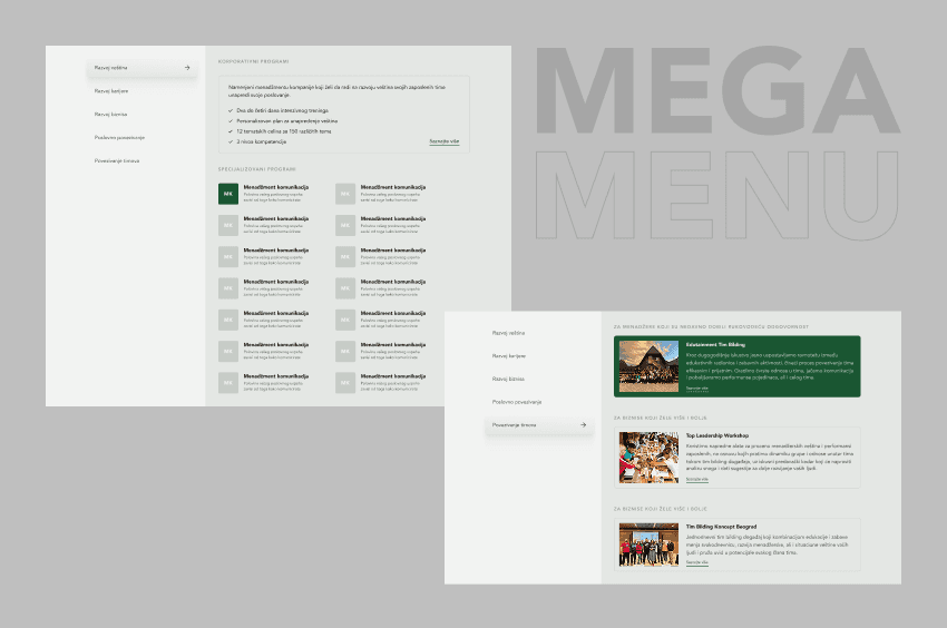
Mega Menu Screens
CHECKOUT PROCESS
Easier enrollment for hot leads
The reservation and enrollment flow was redesigned to reduce friction website had earlier. I shortened forms, added a stepper, and other UI elements so users could complete their registration without hesitation. New checkout felt intuitive, reducing drop-off rates, users said.
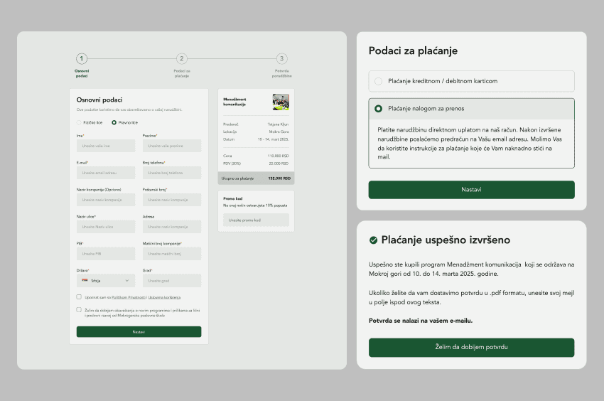
New Checkout Process
BUILDING TRUST
Establishing Mokrogorska as a credible school in a fradulent online learning market
Competitors often present themselves as online course providers, but we wanted to clearly position Mokrogorska as a trusted business school. We highlighted a 16-year history timeline, government-recognized certifications, and long-term partnerships. The team and lecturers were showcased with profiles, experience, and achievements, while alumni testimonials reinforced credibility. Together, these elements distinguished Mokrogorska from short-term online courses and positioned the school as an authoritative and reliable choice for serious learners.
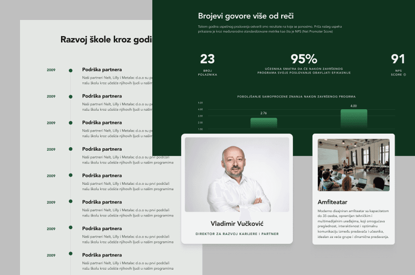
Social Proof Sections
WHAT I HAVE LEARNED
Clarity is always worth the effort
Explaining complex model in simple words and flows taught me that users reward clarity with trust and time
A mega menu invites exploration
Designing the new mega menu showed me how structure alone can spark curiosity and guide people deeper into programs
Business is a marathon
This lesson doesn't have anyhing to do with design, it's just the way how stakeholders position the school in the fradulent market